SpaceConf
The following poster was supposed to be for the SpaceConf conference, taking place the 26th of March 2020. The conference tackled three topics:
-The Stakes of Space: Why are we trying to leave earth instead of fixing it and what is there for us out there.
-The Universe’s Mysteries: What we know and don’t know about the universe, such as black holes, dark matter and nebulas.
-Space Conquest: What is possible in a foreseeable future, the upcoming projects and the state of research.
Unfortunately, the conference had to be cancelled due to the Covid-19 epidemic outbreak and those posters were not used. However, I am still proud of these posters and I like them for what they are, a piece of design.
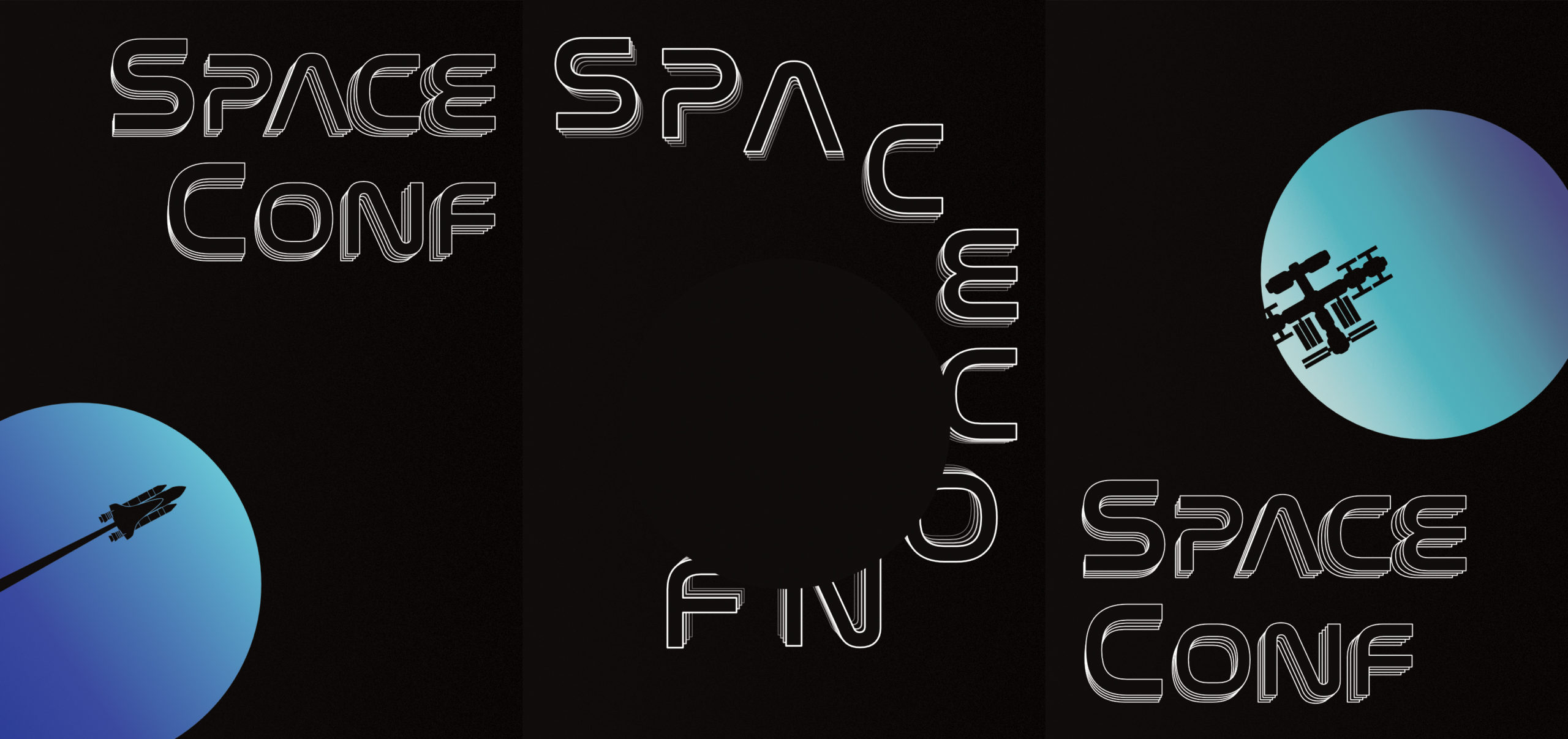
Posters Set
Instead of making one poster, I decided to make three, next to each others.
The main challenge I gave myself was to add as much symbolism with as few shapes as possible because I grew tired of overloading the posters. So I made a propaganda-like poster, using a minimalistic approach with a dark background and accents of color to catch the eye.
Besides using the same font and effect to stay visually coherent, I decided to adapt the same circle for each poster according to what they represent. For every poster from left to right, the circle is shifted a little more to the top right to give the impression of a celestial body orbiting through a telescope. I then tried to use the rule of thirds to place the elements according to what they illustrate. The SpaceConf text is made with a NASA-like font, with the outlines to simulate movement in a holographic way.
I will now go into more detail for every poster.
Left Poster
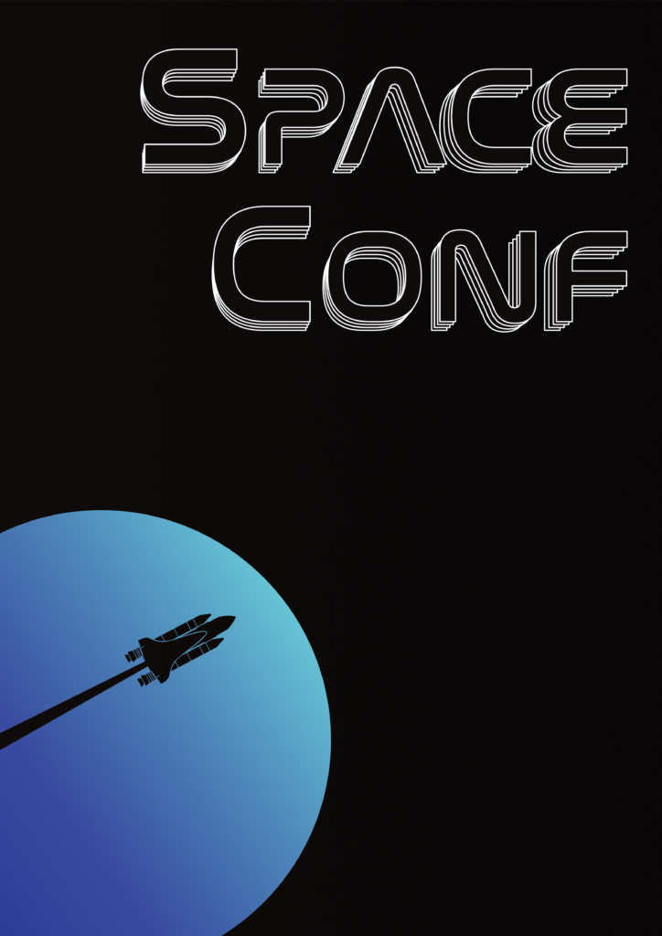
This poster represents a space shuttle leaving earth. I chose this theme for the poster on the left because I wanted the earth to be the starting point of space conquest.
Elements placement
The earth is at the bottom left, to leave room at the top right. The room represents the vastness and the emptiness of the universe, and it is at the top right because it represents the direction of future.
The rocket is leaving the earth at the bottom-left and is headed towards the top-right, and its trail is also crossing out the earth, meaning it’s leaving the earth behind to aim for a better future. The title is at the top right because since it’s our first theme, we still have a long way ahead of us.
Color choices
The earth is in a soft blue-green gradient, the soft blue represents the water, and the green represents the vegetation, the two essential components of life on earth. The gradient is softer than the right poster’s one to give a more soothing effect. The rocket is made out of negative space to illustrate the trail cutting the earth, and to keep a minimalistic use of colors.
Center Poster
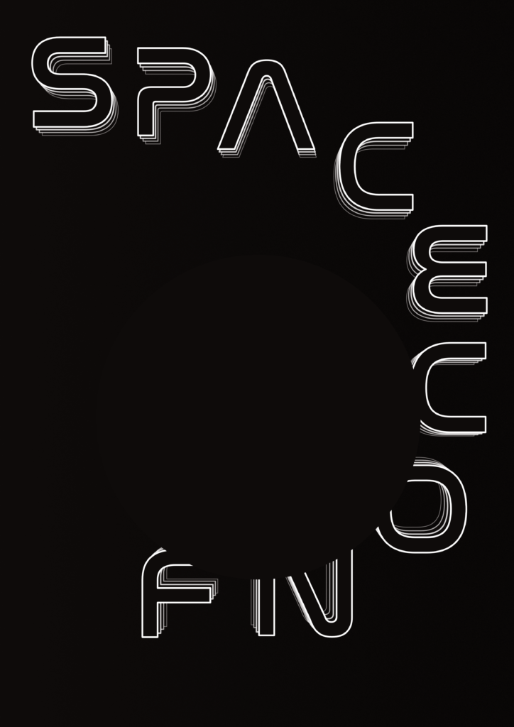
This poster represents a black hole absorbing the title orbiting around. I chose a black-hole visual for the poster because, besides being a discussed subject during the conference, it’s also known to be the center of our galaxy, so it’s only natural for it to be in the middle poster.
Elements placement and color
The black hole is just a different shade of black gradient since black holes emit no light. The outlines behind the title in the other posters are in a fixed position, but in this version the outlines are sucked in by the black hole, hence their different relative position to every letter.
Right Poster
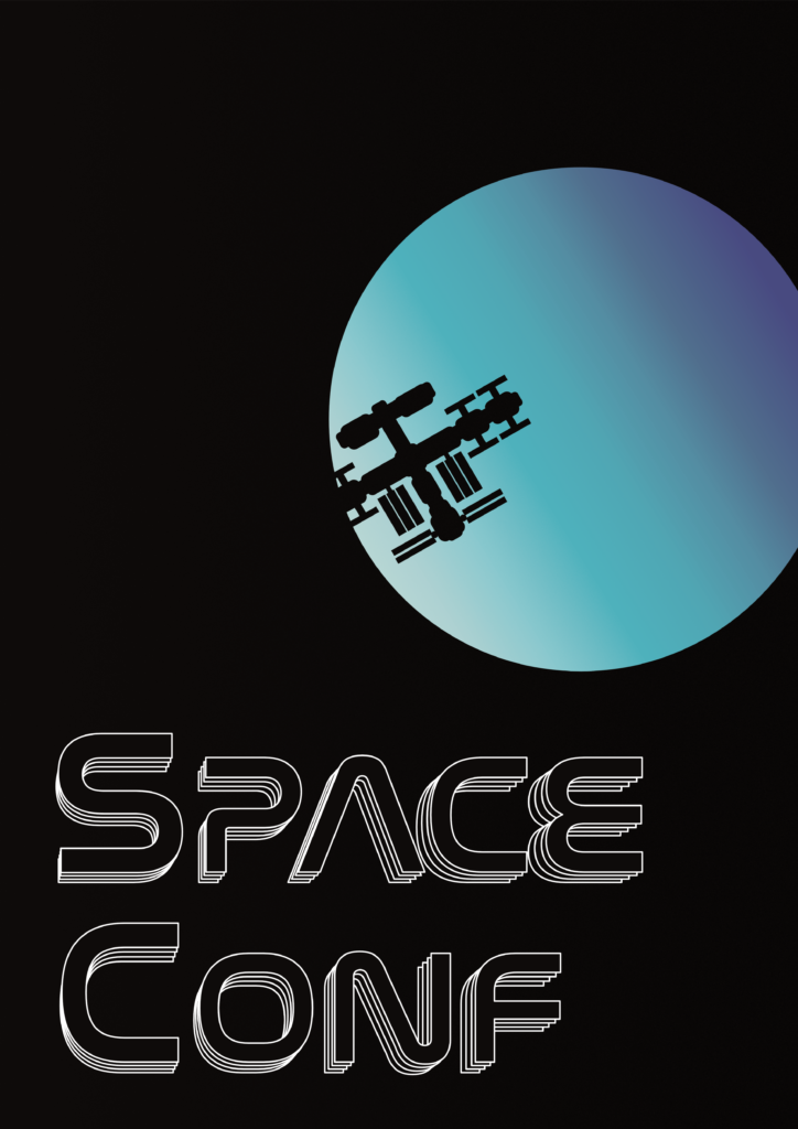
This poster illustrates the ISS passing in front of a planet. The ISS serves as a space research laboratory for astrobiology, astronomy, meteorology, physics, and other fields. That is why I used it as an example for space exploration. It is also the last poster of the set since it shows us reaching our goal.
Elements placement
The planet being far away, it’s placed at the top right to represent the future and what we are aiming towards. The ISS is barely reaching the planet meaning we still have distance to travel. The title is at the bottom left because being the last theme we tackle, the major part of the conference is behind us.
Color choices
The ISS is made out of negative space, like a shadow approaching this planet. The planet itself is in a metallic blue gradient to give a raw and untamable feeling, in opposition with the soft green blue gradient of earth, symbolizing our home.
Conclusion
I made this poster set with the help of Guillaume CRESPIN, a designer friend of mine. It’s one of my proudest achievements because I could add a lot of symbolism in very few shapes, and even though the conference didn’t happen because of Covid-19, I’m glad I could do these visuals. I also learned a lot about negative space and rule of thirds. It also took a lot of trials and errors to get something that my friend and I liked, thus teaching me how a designer works and how he shouldn’t be afraid to start over when needed.